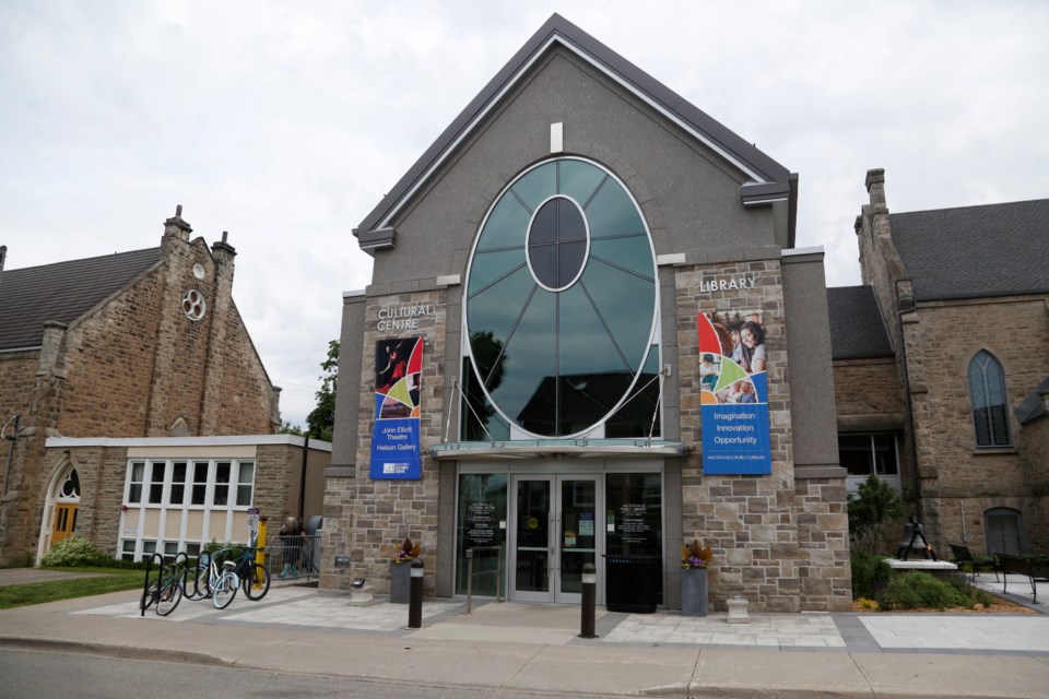
The Halton Hills Public Library (HHPL) logo has a new look.
The local facility recently released its new five-year strategic plan and brand.
According to library officials, the revamped logo uses dots and layering of colours to illustrate points of connection, interconnectivity, and diversity within the Halton Hills community. It also references HHPL’s website URL.
“The modern design will represent the library as it continues to be responsive and relevant, meeting the future needs of Halton Hills,” said HHPL in a press release.

The new strategic plan describes the library’s objectives, goals, mission, values and vision for future success over the next five years. It outlines how the library will focus on: being welcoming and inclusive, supporting community connections, and enriching lives.
The HHPL website has also seen some changes, switching from www.hhpl.on.ca to the simplified www.hhpl.ca to reflect the simplicity of the new brand.
The site now has an expanded home page, a new online calendar, and improved news features to help keep residents up-to-date on all the latest library programs, services and collections.
“We are delighted to launch our new strategic plan and brand and show them to the community,” said Beverley King, acting chief librarian and CEO.
"When talking to people in Halton Hills, we heard time and time again that you consider us the heart of the community, so we will strive to enrich the lives of everyone in Halton Hills through ideas, creativity, and connection in a welcoming, safe, and supportive environment.”
Early next year, the library will also be rolling out a remote book locker kiosk at the Gellert Community Centre, which will provide a new place where residents can pick up requested items, return items, browse and borrow new books and more.


